JQuery has a handy function prototype animate which takes first final CSS properties as the first parameter, and the speed as the second parameter e.g. “fast“, “slow” or the specified time interval. The third parameter is an optional callback after the animation is finished.
var properties = { color: red; };
$('div').animate(properties, "fast", function() {});
At my personal website I recently re-design the page outlook to make it fully mobile user friendly. There is two links at fixed positions of the screen, ‘Navigation’ and ‘Top’.
Navigation
The navigation menu is place after the page main content, and therefore, you would need to define a div with e.g. id=’navigate’. Then add the following JQuery code.
$("a[href='#navigate']").click(function(){
    $("html, body").stop().animate(
        {scrollTop:$("div#navigate").offset().top}, "slow");
        return false;
    })
});
Top
You would first need to define an anchor with e.g.
<a name='top'></a>
Place this right after <body> and add the following JQuery code:
$("a[href='#top']").click(function(){
    $("html, body").stop().animate(
        {scrollTop:0}, "slow");
        return false;
    })
});
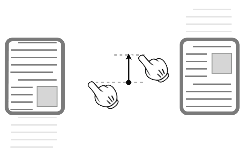
scroll
–EOF (The Ultimate Computing & Technology Blog) —
321 wordsLast Post: Simple Steps Make Website Mobile Friendly (Responsive Design)?
Next Post: A Simple du Implementation using Windows Batch Programming