Although we can all become enthralled to the latest website-building software, we should never lose sight of what a website is trying to communicate. And whether it’s an online gaming site or a style blog, it’s essential to determine a site’s function and communicate that function as clearly and simply as possible.
Content Focus
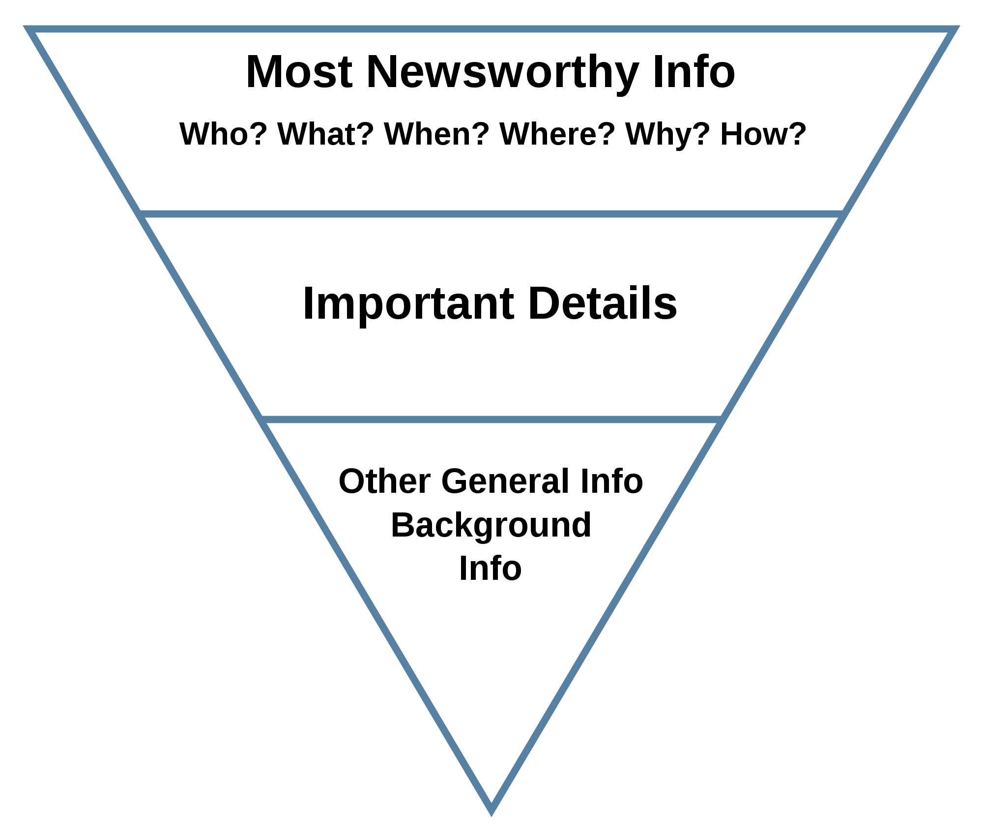
Making sure that the user is able to find the focus of the page’s function within a split second is key to making sure that they don’t hit the back button. A clear headline that sums up the topic in a single sentence will catch the eye, and working with the inverted pyramid model of content is a good way to ensure that you stay focused on the most important aspects of the message that you’re trying to communicate.
And similarly, it’s massively important to ensure that the main content is placed front and central so that the user doesn’t have to wade though off-putting adverts in order to find their desired information that led them to come to the page in the first place.
Organisational Concerns
If all webpages only featured text then we could probably leave it there, but as webpages are often divided into performing a variety of functions, things can get a little more complicated. This is why it’s a good idea to draw up an idea of what you want your website to look like on an A4 page before attempting your design, as this will ensure that things are easy to follow for the user.
A quick look at the Betway gaming site shows us that although the site holds a lot of detail regarding different table games and casino bonuses, it is all presented in a clear and concise manner that makes navigation an effortless task.
Aesthetic considerations
Whilst the casino site makes full use of colourful graphics to add an extra level of aesthetic appeal to the page, it’s important to never let your graphics overpower the basic message. Not only do detailed graphics slow down page-loading times, but they can also have the negative effect of distracting from the main message that you are trying to communicate.
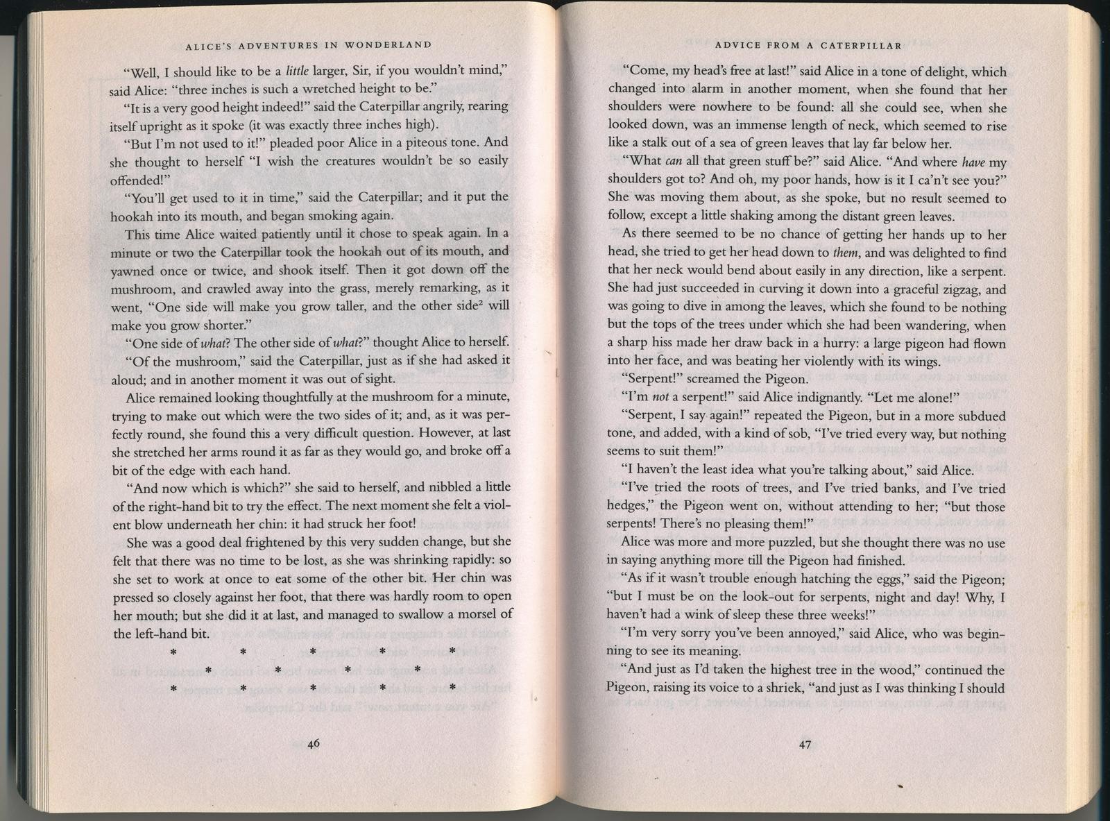
There’s a good reason why books were printed in black ink on white pages, and such considerations carry over into the web domain too with black on white sites being a fail-safe web design option. So just as those casino games effectively recreate traditional table games, your website should be as simple to use and easy to read as that wonderfully familiar book!
–EOF (The Ultimate Computing & Technology Blog) —
loading...
Last Post: How to Allow Displaying PHP Errors to WordPress Administrators?
Next Post: How to Enable/Disable Hibernate Feature on Windows Command Line?


