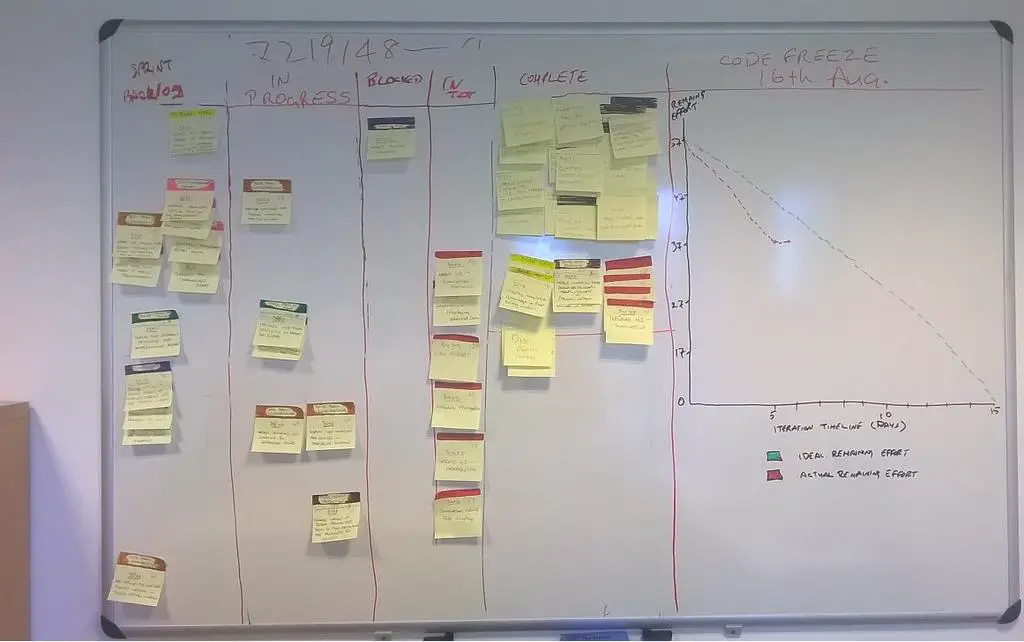
In this post, we have shown to break down tasks and write the tasks on the notes, and attach them to the white boards, in order to monitor the progress of the team. We can also have a burn-down chart, with X-axis the days (time) and the Y-axis the remaining number of tasks (in the form of y = -kx + b)
agile-burn-down-chart
Ideally we should have an expected straight-line (on average) going down that means we finish all the tasks on the deadline. In reality, the line will fall below, which means we are doing better than average (or expected); stay over the line, meaning that we have delayed a little bit. Sometimes, we may fall behind and catch later or vice versa so you will have two lines cross each other.
BTW, drawing on the white-board means so much fun than displaying on the monitor, which is great too!.
–EOF (The Ultimate Computing & Technology Blog) —
222 wordsLast Post: How does it look like when Windows Phone out-of-memory?
Next Post: Free Harddrive Space After Windows 10 Upgrade